Our fully-redesigned incident response experience delivers a more intuitive workflow
The incident response experience on FireHydrant has been fully redesigned for more intuitive workflows. Anyone on your team can easily onboard into an incident and navigate the response process — and you can enforce best practices along the way.

Today we’re releasing fully redesigned Slack and Command Center experiences for FireHydrant so anyone on your team can intuitively navigate the incident response process — in the app or on the web.
There are many things you can do ahead of an incident to help things run smoothly: design and document your process, automate predictable steps, train the team, and run drills. But in the throws of an incident, responders need easy-to-use tools and guided workflows that obliterate cognitive load. With this release, FireHydrant becomes as intuitive as it is powerful.
The all-new Slack experience#the-all-new-slack-experience
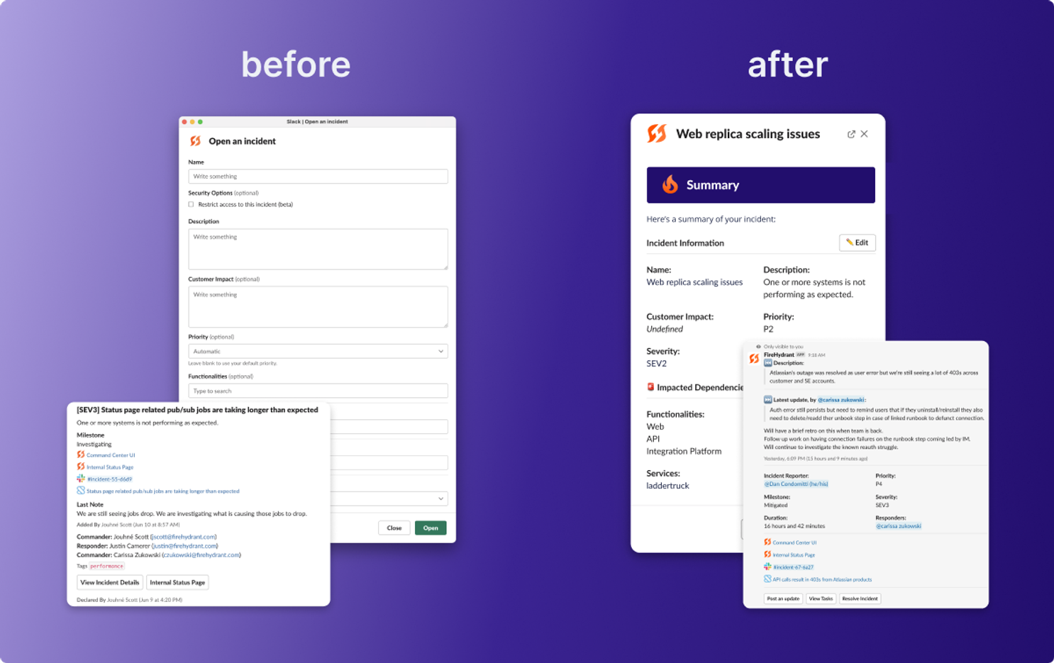
The new Slack experience has a whopping 16 improvements. You can get the full download on our changelog, but we’ll cover the highlights here.
Guided workflows help responders ramp#guided-workflows-help-responders-ramp
Whether it’s your first or 50th time using FireHydrant, it should be easy to know what to do next during an incident. New contextual buttons, incident status message, and updated milestones make our Slack experience simpler and more directive so that responders have less figuring-out-what-to-do-next when creating, joining, and mitigating incidents. Plus, we’ll now encourage users to link their Slack accounts to access FireHydrant’s full feature set — and it’ll only take them two clicks.
Runbooks also got an upgrade. We’ve made it easier for you to help responders work smarter while enforcing best practices. You can now prompt users to run commands by clicking buttons you’ve previously customized and drive more consistent data and discovery with new `empty` and `not` conditions.
Lastly, you’ll notice that incident declaration is much, much simpler. There’s lots of fear and uncertainty when declaring incidents, so the last thing you need is multiple open text fields and unpredictable outcomes for who gets paged. We’ve redesigned the incident declaration modal so there’s just a single field and drop down alongside predefined incident types that describe outcomes clearly. And, if engineers with more information are declaring incidents they can easily edit those fields at incident declaration to fully capture the scope of the impact.
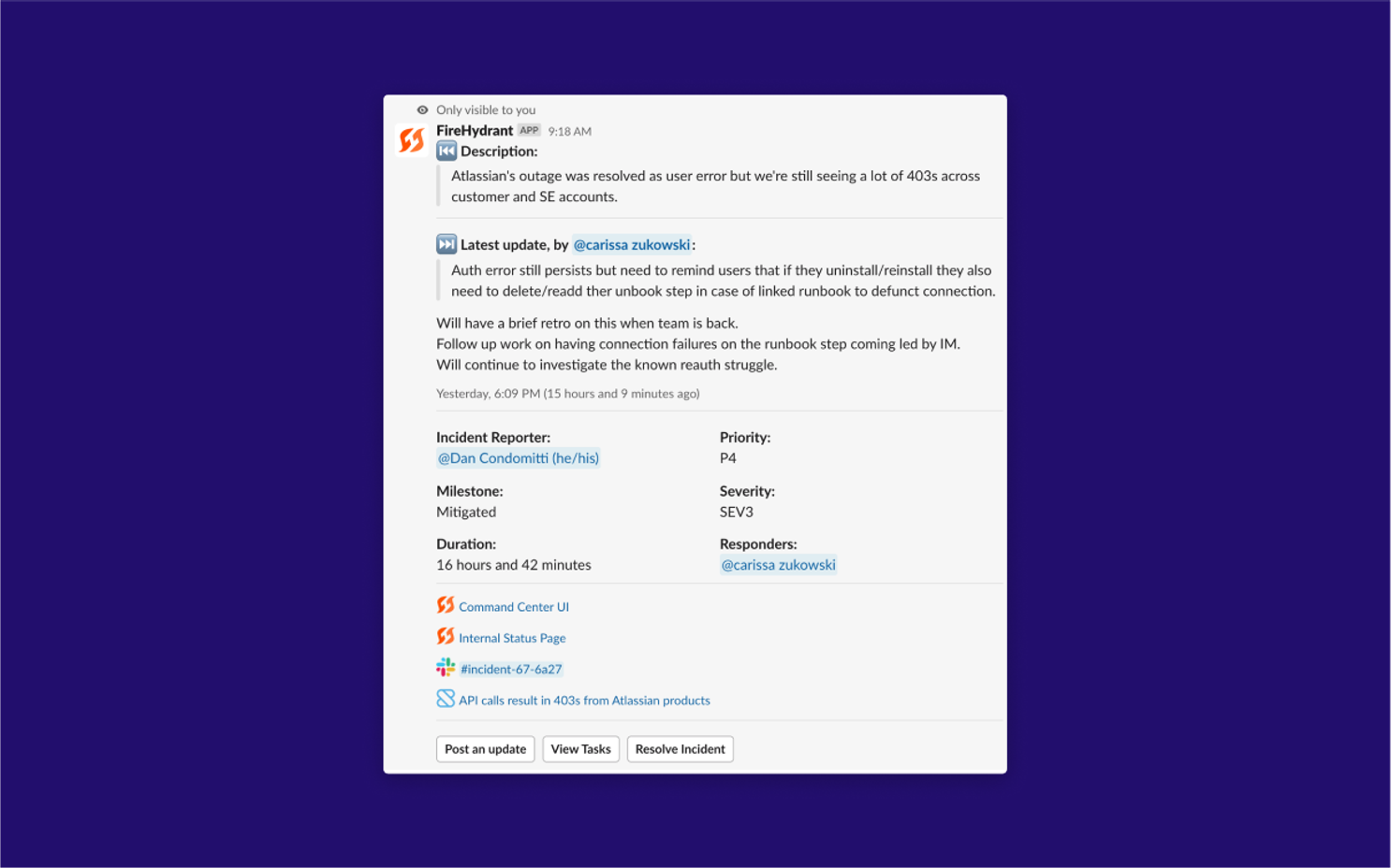
/fh is now more powerful — and straightforward#fh-is-now-more-powerful-and-straightforward
FireHydrant commands got a hefty overhaul. Now you can ensure the correct people are working on the incident with team previews on team assignment. And we’ve smoothed out some key pieces of the incident lifecycle with new commands for resolving incidents and kicking off your retro.
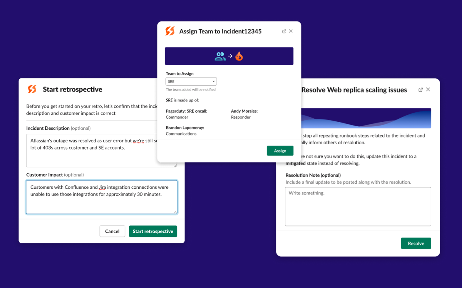
/fh assign team
Ensure that you are always bringing the right people into an incident by assigning teams that will pull in responders based on on-call schedules and default roles. Reduce the fear in assignment with a preview of the team before assigning them to the incident.
/fh resolve
Incident resolution deserves a celebratory comment, we’ve now added the ability to include update messages at resolution time and the ability to post those to your configured status pages.
/fh start retro
Kick off your retrospective right from the Slack channel. FireHydrant will also prompt you to update the description and customer impact of the incident so that you can ensure you capture the incident details while it’s still fresh in your head.
Simplified design eliminates distracting noise#simplified-design-eliminates-distracting-noise
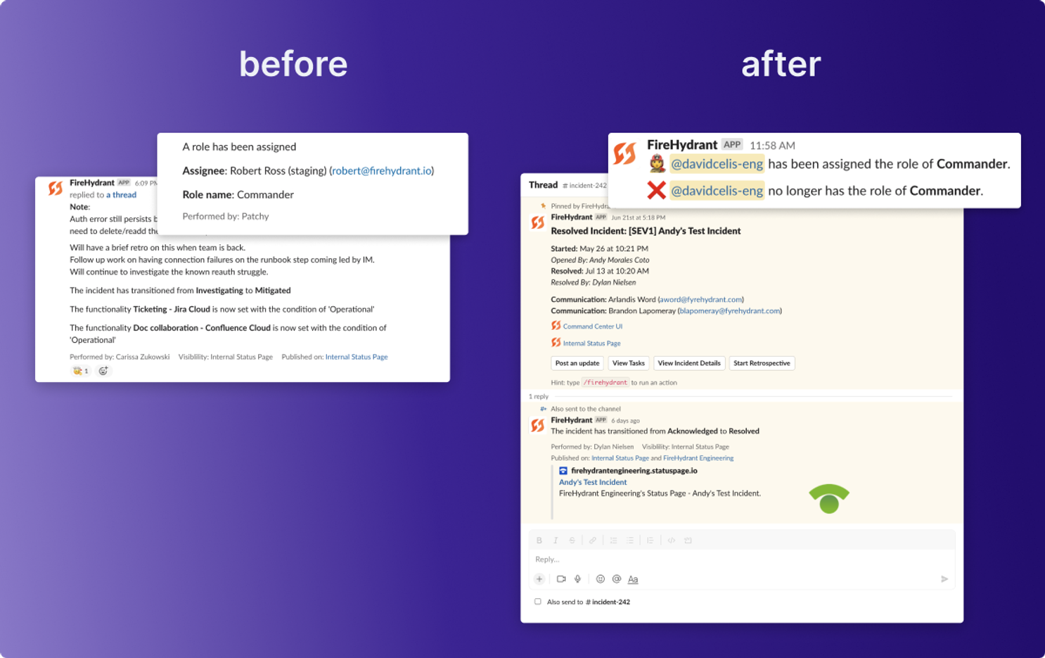
We heard you loud and clear: Shhhhh! We’ve reduced the amount of noise that the Slack bot makes during an incident and added reply threading where it counts.
A redesigned Command Center adds Incident Response redundancy#a-redesigned-command-center-adds-incident-response-redundancy
We love Slack as much as you do (and that uptime transparency is :chefs kiss:). But since so much of the web runs on the same critical infrastructure, it’s essential for incident management tools to have built-in failover mechanisms. The Command Center redesign brings feature parity with our Slack app to the web UI, ensuring you can run your incident response process regardless of Slack availability.
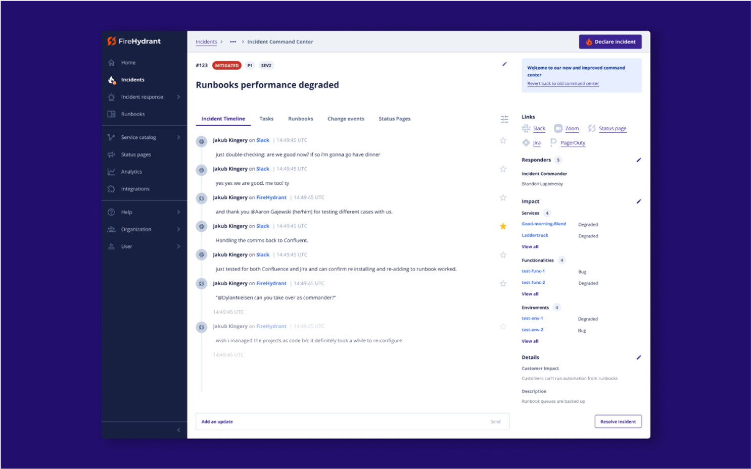
The Command Center is also looking a lot slicker these days. We’ve completely redesigned the interface and all interactions to be easier to find, easier to use, and more in line with our Slack experience. And it’s now responsive on mobile so you can access your data on whatever device works best for you.
Building toward the most intuitive incident response workflow#building-toward-the-most-intuitive-incident-response-workflow
Today’s release comes as a direct response to the feedback we’ve received from our customers – and some folks that never became customers. Our team has decades of combined on-call experience, so we understand the outsized importance of simplicity and usability for any tool you’re using during an incident. Our product team, including our talented designers, share a relentless focus on reducing cognitive load for our users. Rolling our sleeves up for this redesign gave us the opportunity to convey these beliefs where it counts: in our most-used interfaces. We’d like anyone on your team to be able to easily navigate our platform – even during a high-stakes, high-stress incident. If you’ve got ideas on how we can go further in this effort I’d love to hear them. You can reach me at dylan@firehydrant.com.