Analytics Basics
Note:
The Analytics are limited to Enterprise tier users.
FireHydrant provides in-depth analytics so you can understand the health and state of your organization. The Analytics are split into the following subpages:
- Incidents and Impact - Statistics and metrics on incidents by components, severity, and more
- Resources and Tasks - Graphs and charts of Retrospectives, Tasks/Follow-Ups completion, and incidents by team
- Data Export - Dedicated page for selecting, filtering, and exporting specific reports
To read more about each of these, visit the corresponding pages for each section.
Quickstart
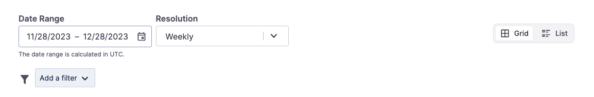
Filters at the top of each Analytics page
Filtering Data
- Select a date range - By default, the Date Range is set to the previous 30 days and filters in UTC timestamps. For example, if you select a date range of
03/20/2022-03/23/2022we will pull data between03/20/2022 00:00:00 UTCand03/23/2022 23:59:59 UTC. - Choose a resolution - The Resolution defaults to weekly, but you can change it to daily or monthly if desired. This will largely depend on what date range you are looking at.
- Display options - On the right, you can toggle between Grid format, which displays each chart in a grid two graphs wide, or List format, which shows all the charts in single-column format. Responsiveness settings will automatically convert the page to List format if your screen/window is not wide enough to reasonably display in a grid.
- [Optional] Add some filters. Conditional filters can be used to refine the specificity of your query. You can apply multiple filters. For example, Teams could use this to compare Mean Time to Resolution between Assigned Teams or identify the number of SEV1 incidents resolved within the last week. We support the following filters:
- Current severity
- Current priority
- Current milestone
- Incident impacted infrastructure
- Incident assigned teams
- Incident attached Runbooks
- Incident tags
- Any Incident Custom Fields you've configured
Note:
By default, all
GAMEDAYandMAINTENANCEseverity incidents are omitted from the Analytics calculations.
Exporting Graphs and CSV
Once you've filtered the data you'd like to see, each chart has a download icon at the top right, allowing you to export the image to PNG or export the data via CSV.
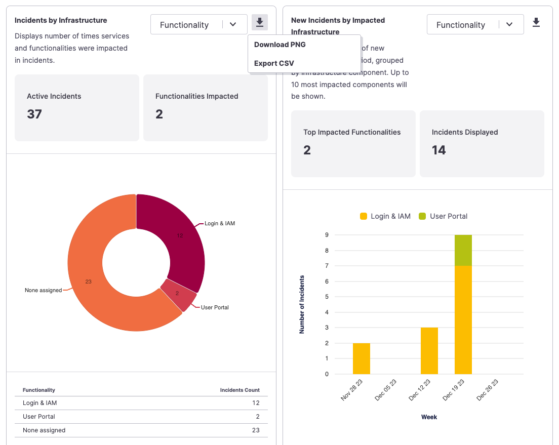
Exporting a specific chart
Active Incidents
Each Analytics subpage (except the new Impact Statistics page) shows statistics for all incidents that were active at any point within the time window. For example, if your time window is set to one day, an incident created more than a day ago but is still ongoing would be included in the metrics. This is why the number of incidents Created may be less than Resolved or mismatched.
Data Export
The Data Export tab provides users with a streamlined option to export different types of high-level data reports to a user’s emails, filtering on different date ranges and filters. Some of these reports provide the same information displayed in the charts in the previous two tabs. If your team wants more detail or raw data, we advise using thebulk export feature.
Check out more on our Reports here.
Next Steps
- Browse each of the specific analytics subpages we offer:
- Look at our batch CSV Data Export functionality
Updated 3 months ago